Geo-Spatial Analysis on UFO sighting data

Experiment
Geo-Spatial
Data-Analysis
Author

F.L

Published

June 8, 2024

Introduction

I first encounter UFO for my master degree. Not literally. I need a project for my “Data Viz” module. But back then my geo-spatial analysis skills was limited.

This little project will look over these data an attempt to answer questions such as:

  • Where can I find aliens?
  • What does a UFO typically looks like (based on description)?
  • Has alien left us since the 1980s? (temporal patterns)

UFO Heatmap 1910-2014

The Data

Data includes both logitude location and times. So can do both time series or spatial viz. Source: https://www.kaggle.com/NUFORC/ufo-sightings

The complete data includes entries where the location of the sighting was not found or blank (0.8146%) or have an erroneous or blank time (8.0237%). Since the reports date back to the 20th century, some older data might be obscured. Data contains city, state, time, description, and duration of each sighting.

library(tidyverse)
library(sf)
library(leaflet)

.label_data_src = "data source: NUFORC data by Sigmond Axel (2014)"

## read data and clean date
ufo <- read_csv('./scrubbed.csv') |> 
  janitor::clean_names() |> 
  mutate(
     datetime = as_datetime(datetime, format = "%m/%e/%Y %R")
    ,date_posted = as_date(date_posted, format="%m/%e/%Y")) |> 
  mutate(id = row_number()) |> 
  relocate(id)

## convert to sf object
ufo_points = ufo |> 
  filter(!is.na(latitude) & !is.na(longitude)) |> 
  filter(!(latitude == 0 & longitude == 0)) |> 
  drop_na() |> 
  sf::st_as_sf(coords=c("longitude","latitude"),crs=4326)

# df_scr <- read_csv('./scrubbed.csv') |> janitor::clean_names()

## Below used to analysis how to format date
# ## analysis to check which one is digit which one is date, which one is month
# df_com |> 
#   select(datetime) |> 
#   mutate(
#     md1 = str_extract(datetime, "^\\d{1,2}")
#     ,md2 = str_extract(datetime, "(?<=[\\d]{2}\\/)\\d{1,2}")
#   ) |> 
#   distinct(md1,md2)
# ## first digit is month, second is date
# stopifnot(0!=df_com |> 
#   select(datetime) |> 
#   mutate(datetime_ = as_datetime(datetime, format="%m/%e/%Y %R")) |> 
#   filter(day(datetime_) > 12) |> 
#   nrow())
# ## the format you want to extract is "%m/%e/%Y %R" use lubridate dattiem

Exploratory Analysis
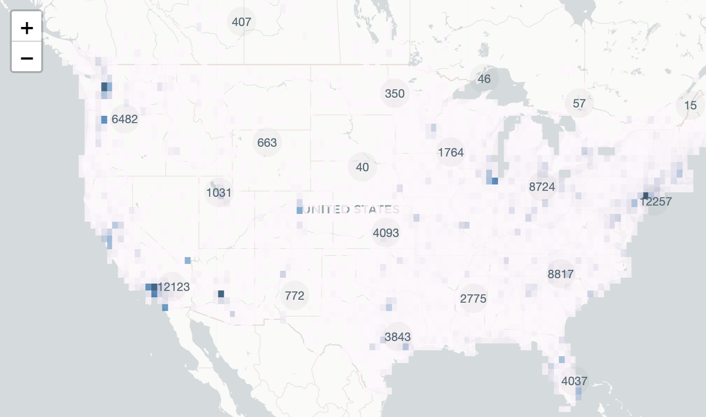
Grand Map View

Here is an interactive visualisation for all the code

[1] "The propotion of data visualised is: 0.83"
[1] "1910-01-02 UTC" "2014-05-08 UTC"
create UFO icon map - make icon
## over all scale using 
ufo_icon = makeIcon(iconUrl = "./asset/ufo.png",
                    iconWidth = 25, iconHeight = 25)

## a javascript function which creates clusters
clus_func_js = function() {
  JS("  
    function(cluster) {  
       return new L.DivIcon({  
         html: '<div style=\"background-color:rgba(77,77,77,0.05)\"><span>' + cluster.getChildCount() + '</div><span>',  
         className: 'marker-cluster'  
       });  
       }")
}

## crystallize above code into a function
addUFOMarker = function(x) {
  addMarkers(
    x,
    ## automatically add sf object
    icon = ufo_icon,  
    clusterOptions = markerClusterOptions(  
      iconCreateFunction = clus_func_js()
    ),  
    ## sorry! depends on having below columns
    label = ~ label,
    popup = ~comments_,
    group = "ufo"
  )
}

## Make UFO Icon ---------------------------------------------------------------
## access polygon data
country_polygons = spData::world |> 
  filter(iso_a2 %in% c("GB","US","CA"))

## make grid on top of the layer
mesh=sf::st_make_grid(
     country_polygons
    ,cellsize = c(0.5,0.5)
    ,square = T
  )
## intersect points 
ids = st_intersects(mesh,ufo_points)
which_non_zeros = which(lengths(ids) != 0)
pixels =st_as_sf(x=mesh[which_non_zeros])
pixels$n = lengths(ids)[which_non_zeros]

## Make the Map ----------------------------------------------------------------

## leaflet color palete
pal <- colorNumeric(
  palette = "PuBu",
  domain = sqrt(pixels$n))

## use base layer of map
## set view to USA
us_lon <- -95.71 #W
us_lat <- 37.09 #N
base_map = ufo_points |> 
  mutate(
     label = paste(city,state,country,shape)
    ,comments_ = paste0(datetime,": ", comments)
  ) |> 
  leaflet()  |> 
  setView(lng = us_lon, lat = us_lat, zoom =4) |> 
  addProviderTiles(providers$CartoDB.Positron)

## the grand map himself
base_map |> 
  addPolygons(
    data=pixels,stroke=F,fillColor = ~pal(sqrt(pixels$n))
    , fillOpacity = 0.8
    , group = "heatmap") |> 
  addUFOMarker() |> ## leaflet color palete
  addLayersControl(
    overlayGroups=c("ufo","heatmap")
  )

If you explore this map, you will find there are barely any record outside North America The majority of sighting concentrate on US. Actually if you identify the rest of the data. Majority comes from a country that is not US…

ufo |> 
  left_join(select(ufo_points,id),"id",keep=T,suffix=c("","_p")) |>
  filter(is.na(id_p)) |> 
  slice_sample(n=10)
ufo |> 
  left_join(select(ufo_points,id),"id",keep=T,suffix=c("","_p")) |>
  filter(is.na(id_p)) |> 
  group_by(country) |> 
  # mutate(country=coalesce(country,paste("-",state))) |> 
  count() |> 
  arrange(desc(n))

We are missing 1894 Great Britain sighting.

In some cases the “UFOs” concentrate at one point:

(a) Concentrated Sightings at NYC
(b) Civic Centre in 1964
Figure 1: About 500 sighting squished into one spot, nearest location is NY civic center.

It is likely that those data does not have specific coordinate so they are squished together into one marker.

Sighting Over Time

Next lets overview if there are any temporary pattern in terms of number of UFO sightings.

animation map
library(plotly)
library(RColorBrewer)
mapbox_token = Sys.getenv("MAPBOX_TOKEN")

## add coordinates to data (very not-elegant)
xy=sf::st_coordinates(ufo_points)
ufo_points$lon = xy[,1]
ufo_points$lat = xy[,2]
ufo_points$year = year(ufo_points$datetime)

## animation map himself
ufo_points |> 
  plot_ly(
    type='densitymapbox'
    ,frame = ~year
  ) |> 
  add_trace(
     radius = 5
    ,lon = ~lon
    ,lat = ~lat
    ,colorscale="Electric"## refer to plotly OOP document, this is shared with Python
    ,showlegend=F
  ) |> 
  config(mapboxAccessToken = Sys.getenv("MAPBOX_TOKEN")) |> 
  layout(
    mapbox = list(
      # style="carto-positron",
      style="dark",## this only works if you have mapbox token
      zoom=2.5,
      center= list(lon=us_lon,lat=us_lat))
    # , coloraxis = list(colorscale="Viridis")
    ) |> 
  animation_opts(
    150,
    easing = "sin", #redraw = FALSE
  )
Code
ufo |> 
  left_join(select(ufo_points,id),"id",keep=T,suffix=c("","_p")) |>
  mutate(
    month_year=floor_date(datetime,"months"),
    miss_coord=is.na(id_p)) |> 
  group_by(month_year,miss_coord) |> 
  summarise(n=n(),.groups="drop") |> 
  ggplot(aes(x=month_year,y=n,color=miss_coord)) +
  geom_line() +
  theme_minimal() +
  ylab("number of occurance") +
  xlab("month and year") + 
  geom_vline(xintercept=as.POSIXct(ymd("1990-01-01")),linetype="dashed",color="midnightblue") +
  annotate("text"
        ,x=as.POSIXct(ymd("1990-01-01")),y=700
        ,label="Year 1990",color="midnightblue") +
  ggtitle("UFO Sighting between 1910-2014 around the World") +
  scale_color_manual(
    values=c("TRUE"="grey","FALSE"="black"),name="",labels=c("TRUE"="Not on Map","FALSE"="On Map")) +
  theme(legend.position="top")

ufo_weight = ufo |> 
  select(id,duration_seconds) |> 
  mutate(weight = log(duration_seconds)) ## normalized weight

Below we are focusing on the US, analyzing 1990 onward:

Code
## Seasonal Pattern
ufo |> 
  mutate(month_w = isoweek(datetime),year=year(datetime)) |> 
  group_by(month_w,year,country) |> 
  filter(country == "us") |> 
  filter(year >= 1990) |> 
  summarise(n = as.double( n() ), .groups="drop") |> 
  ungroup() |> 
  mutate(across(c(month_w,year), as.factor)) |> 
  ggplot(aes(x = month_w,y=year,fill=n)) + 
  geom_bin2d() +
  facet_wrap(~country,scales="free") +
  theme_minimal() +
  scale_fill_viridis_c(option="E",trans="sqrt") +
  # geom_vline(xintercept=c(6,7),linetype="dashed",alpha=c(0.3,1)) +
  coord_polar(start = -pi/53) +
  ggtitle("Count of UFO sighting in US by Week 1990 - 2014") +
  theme(legend.position = "none")
## temporary pattern
ufo |> 
  filter(country == "us") |> 
  mutate(hour = hour(datetime),year=year(datetime)) |> 
  filter(year >= 1990) |>
  group_by(hour,year) |> 
  summarise(n = n()/(365 * 24),.groups="drop") |> 
  ungroup() |> 
  ## ploting
  mutate(across(c(hour,year), as.factor)) |> 
  ggplot(aes(x = hour,y=year,fill=n)) + 
  geom_bin2d() +
  scale_fill_viridis_c(option="E",trans="sqrt") +
  theme_minimal() +
  scale_y_discrete(labels= c() ) +
  coord_polar(start= -pi/24) +
  ## annotate a layer of 
  geom_vline(aes(xintercept=21),color="black",linetype="dashed") +
  ggtitle("Every hour, average sightings of UFO in US, 1990 - 2014") +
  theme(
    legend.position = "none")

The hourly pattern is more clear than yearly pattern. The peak interval for UFO spotting time is 20:00 - 22:00 (the usual time when I decide to pull a glass of wine). There are not much pattern in terms of week other than than the fact that it tend to happen in holidays.

There are systematic ways of analyzing cycles. A spectrum analysis could be extremely helpful here. Or a “periodontal”. I am also curious if incorporating public holidays in the US will explain more temporary variance. This two maybe solved by fit a machine learning model.

Considerably, where the time occurs is also important. The animated map has verified that sighting tend to happen “high population density” cities. Rumor say UFO sighting happens near water because the flying source use water as fuel. Arguably, for archaeology reasons, cities tends to developed around rivers and ports. So it is hard to tell if UFO appears because of water or cities, until we whichever better explains variance in the model.

Shape and Description of UFO

Classic text analysis often uses “tf-idf” (term frequency and inverse document frequency). I find this matrix less usefully since many of the “comment” are actually short-text. Term frequency within document are mostly 1 or 2. In fact in this data, the mix term frequency after taken out stop words are 5.

I took a much simply English analysis but counting only nous and adjectives. This gaves us a flavour of what’s been used to describe UFO.

calculate essential matrix
library(tidytext)
# if (!require("pacman")) install.packages("pacman"); library(pacman)
# p_load_gh('hrbrmstr/pluralize')

## we want to focus on nonu and adjectives
nonu_adj = parts_of_speech |> 
  filter(pos == 'Nonu' | pos == 'Adjective') |> 
  group_by(word) |> 
  slice_head()

## convert comments into short text
ufo_terms_us_year = ufo |> 
  
  filter(country == 'us') |> 
  filter(year(datetime) >= 1950) |> 
  
  ## take out stop words and keep only nonu and adjuctives
  unnest_tokens(word,comments) |> 
  anti_join(stop_words,"word") |>
  inner_join(nonu_adj,"word") |> 
  filter(!word |> str_detect('\\d')) |>
  
  count(id,word) |> 
  left_join(select(ufo, id, duration_seconds, datetime)) |> 
  mutate(year = year(datetime)) |> 
  
  ## group wise term-frequency
  group_by(year) |> 
  mutate(total_n = sum(n)) |> 
  ungroup() |> 
  group_by(year, word) |> 
  mutate(
    tf_year = sum(n)/total_n ) |>  
  ungroup() |> 
  
  ## idf-inverse document frequency acrros
  mutate(
    n_doc = unique(id) |> length()
  ) |> 
  group_by(word) |> 
  mutate(n_doc_term = unique(id) |> length() ) |> 
  ungroup() |> 
  mutate(g_idf = log(n_doc/n_doc_term )) |> 
  
  ## this new term uses frequency of term within year;
  ## global inverse document frequency
  mutate(tf_idf_year_g = tf_year * g_idf) |> 
  ## add in comparation
  bind_tf_idf(word,id,n)
Joining with `by = join_by(id)`
Code
require(patchwork)


top_n_term = ufo_terms_us_year |> 
  group_by(word) |> 
  summarise(n=sum(n), .groups = "drop") |> 
  ungroup() |> 
  slice_max(n=35, order_by = n) |> 
  mutate(freq=n/sum(n))

my_palette = generate_palette(c(top_n_term$word, 'triangular'))

g1 = top_n_term |> 
  mutate(word = factor(word, rev( top_n_term$word) )) |> 
  ggplot(aes(y=word, x=freq, fill = word)) +
  geom_col() + 
  theme_minimal() + 
  scale_fill_manual(values =  my_palette, guide=NULL) +
  ylab("") + 
  xlab("") +
  ggtitle("", "Global frequency of term") + 
  theme(
    panel.grid.major.x=element_blank(),
    panel.grid.minor.x=element_blank(),
    panel.grid.minor.y=element_blank(),
    panel.grid.major.y=element_blank()
  )
  
highlight_w = c("red", "white", "green", "yellow",  "moving")
g2 = ufo_terms_us_year |> 
  distinct(word,year,tf_year) |> 
  plot_word_line(tf_year, highlight_w = highlight_w ) +
  theme(
    panel.grid.major.x=element_blank(),
    panel.grid.minor.x=element_blank(),
    panel.grid.minor.y=element_blank()
  ) +
  ylab("Term Frequency of the year") + 
  xlab("") +
  ggtitle("","Frequency of term by year")


(g2 | g1 + 
  plot_layout(width = c(5,2))) +
  plot_annotation(
    title="<b>UFOs are spotted more red than green</b>",
    caption = .label_data_src,
    subtitle = strwrap(glue::glue(
      "Frequency of nouns and adjuctives used to describe UFO event after 1970s. Top 35 terms are shown on the left. Nouns associated to color are highligted",
      ""
    )),
    theme=theme(plot.title=ggtext::element_markdown())
    )

If we look at top nouns and adjectives, it is no surprise we see “flying” or “moving”. I find it interesting that Red and Green are two color of complete opposite spectrum, yet after 2000 more UFO are more likely to be described as red than green.

I’ve not highlighted shape yet because it turns out “shape” is a column on its own. I included a bit more data from after 1950s so

Code
ufo_shapes_p = ufo |> 
  mutate(year = year(datetime)) |>
  group_by(year, shape) |> 
  
  summarise(
    n = n(),
    .groups = "drop"
  )  |> 
  mutate(total_n = sum(n)) |> 
  ## total number of doc of year
    group_by(year) |> 
    mutate(year_n = sum(n)) |> 
    ungroup() |> 
  ## total world count
    group_by(shape) |> 
    mutate(shape_n = sum(n) ) |> 
    ungroup() |> 
  ## calculate propoability
  mutate(
    p_shape = shape_n / total_n,
    p = round(pbinom(n, size=year_n, prob = p_shape, lower.tail=F),4)
  ) |> 
  
  mutate(freq = (n + 0.5)/ (year_n + 0.5))

high_freq_shape = ufo_shapes_p |> 
  group_by(shape) |> 
  summarise(n = sum(n)) |> 
  filter(!shape |> is.na()) |> 
  mutate(shape = fct_infreq(shape,n)) |> 
  filter(n > quantile(n, 0.60))
  
ufo_shapes = ufo_shapes_p |> 
  mutate(pp= 1-p) |> 
  filter(year > 1950) |> 
  # filter(pp > 0.95) |> 
  semi_join(high_freq_shape, "shape") |> 
  arrange(-desc(freq)) |> 
  mutate(
    shape=fct_inorder(shape)
  )

## fit lm to detect trend automatically
ufo_lm = ufo_shapes |> 
  group_by(shape) |> 
  mutate(
    cov_ = (year - mean(year)) * (freq - mean(freq))
  ) |> 
  summarise(pearson_r = sum(cov_) / (sd(year) * sd(freq) * n()) )
  

trend_palette =  c("-"="#D35400", "+"="#28B463", "0" = "#AAB7B8")

g3 = ufo_shapes |> 
  group_by(shape) |> 
  ## calculate global frequency
  summarise(n = sum(n), .groups="drop") |> 
  mutate(freq = n/sum(n)) |> 
  left_join(ufo_lm, "shape") |> 
  mutate(sign = ifelse(
    abs(pearson_r) > 0.45,
    ifelse(pearson_r < 0,"-","+" ),
    "0")) |>
  ## plot specific
  mutate(.n= 1/n) |> 
  mutate(
    shape = fct_infreq(shape,.n),
    .is_edge = freq> quantile(freq,0.9),
    .hjust = ifelse(.is_edge, 1.2,-0.2),
    .color=ifelse(.is_edge,"white", "#873600"),
    .label = ifelse(sign != "0", round(freq,2), "")
  ) |> 
  ggplot(aes(x = freq, y = shape, fill=sign)) +
  geom_col(width=0.7) + 
  geom_text(
    aes(label = .label, hjust=.hjust , color=.color)
    ,size=4) +
  scale_color_identity() +
  scale_fill_manual(
    values = trend_palette, guide = NULL
  ) + 
  theme_void() +
  theme(
    axis.text.y = element_text(size = 7)
  )

## visualise trend
ufo_shapes_trend_vis_data = ufo_shapes |> 
  left_join(ufo_lm, "shape") |> 
  filter(abs(pearson_r) > 0.45) |> 
  mutate(sign = ifelse(pearson_r < 0,"-","+" )) 

ufo_shapes_trend_vis_data_ends = ufo_shapes_trend_vis_data |> 
  group_by(shape) |> 
  filter(year == max(year) | year == min(year))

g4 = ufo_shapes_trend_vis_data |> 
  ggplot(
    aes(x =year,y=freq)) + 
  ## grey background
  geom_line(
    data = ufo_shapes |> mutate(shape2=shape) |> select(-shape),
    aes(group=shape2), color="grey", size=0.3, alpha=0.5) + 
  ## major line 
  geom_line(aes(color=sign)
            , size=1) +
  geom_point(
    data = ufo_shapes_trend_vis_data_ends, 
    aes(color=sign)
  ) +
  geom_text(
    data = ufo_shapes_trend_vis_data_ends |> slice_max(n=1,order_by=year),
    vjust=-1,hjust=1,
    aes(color=sign, label = round(freq,2))
  ) +
  ## annotation
  ## layout
  ylab("Frequency of Shape") + 
  facet_wrap(~shape) +
  theme_minimal() +
  theme(
    panel.grid.major.x=element_blank(),
    panel.grid.minor.x=element_blank(),
    panel.grid.minor.y=element_blank()
  ) + 
  scale_color_manual(values=trend_palette, guide=F)
  

require(ggtext)
(g4 | g3) + patchwork::plot_layout(widths = c(4,1)) +
  patchwork::plot_annotation(
    title="<b>UFO has been seen less circular</b>", 
    str_replace(str_wrap(glue::glue("Showing 5 of 30 most significant trend",
    " mesaured by pearson corelation coefficency.",
    " Downward trend are shown in <b><span style='color: #D35400'>orange</span></b> and upward trend in <b><span style='color: #229954'>green</span></b>. <br><br>",
    "In addtion top 12 most frequent shape are shown. They represent 60% of the shape")), "\n","<br>"),
    caption=.label_data_src,
    theme=theme(
      plot.subtitle=ggtext::element_markdown(lineheight = 1.1),
      plot.title=ggtext::element_markdown())
  )

There are about 30 different shaped used to label UFO sighting events. There are going to be a lot of visual load. I have cut off data point before 1950 because values are too small. How I have selected 5 out of 30 shapes is by use “Pearson’s R”(x are year, y are frequency) which are great at spotting consistent line like relationship (but not arch. See Schober et al, 2018). For this reason I’ve select those “Pearson’s R” is higher than 45 %.

Methodologically, I feel a bit unsettled because prior 200. Low level of data are collected. As how term frequency is measured, the variance in early years will be much higher than those in later years. It is possible that Pearson’s R is high or low simply because of a random deviant from early year which is lack of data. I supposed a better approach would be re-patch data use “uneven” time interval. For example, before 1950 aggregate data point by every 5 years, after 2000 aggregated data point by every quarter. I suppose those subject to further study.

Never the less, this method successfully delivered “clear” trends for the visual.

We see less proportion of UFO event describe “cigar”, “disk” or “oval” and more describe “triangle” or “light”. The most obvious trend is “disk”, At 1950, nearly half record describe “UFO” sighting as disk. Towards the end this is only 3%.

Conclusion

Has different species of Alien been visiting earth? I don’t think so! I too wondered why it has to be “green” or “red” light. Surely advanced civilization should appreciated different color. I quickly goggled “military aircraft” and immediately realize what the “green” and “red” color are. Here a quote from Wikipedia:

“Some navigation lights are colour-coded red and green to aid traffic control by identifying the craft’s orientation. Their placement is mandated by international conventions or civil authorities such as the International Maritime Organization (IMO).”

Military Light

Formation Light

I think those people has just been seeing airplanes. Specially that those in the high population density area witness more UFO events. Finally UFOs are often seen after dark around 20:00. That could also explains why so many description mentioned light.

For those keen UFO enthusiasm looking for genuine sightings, they will now have to filter through possible dozens of false alert. Or of course, if they are smart, they could gather description of “airplane sighting”, training a model and use to to filter out those false alert. That is a rabbit hole I’ve been trying to avoid.